
Customize Chart
Last Updated: Feb 8, 2021
Last Updated: Feb 8, 2021
Use Chart Properties to customize the Chart and create a more meaningful and visually appealing Presentation.
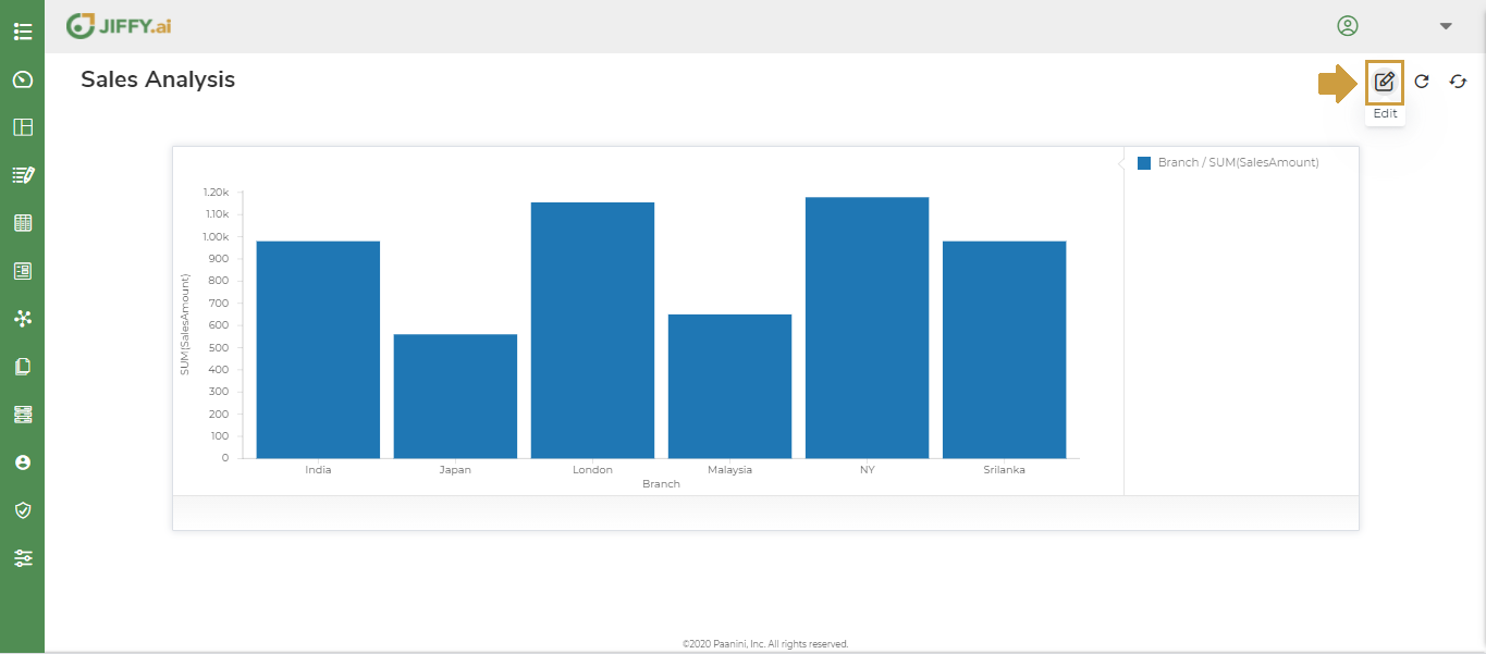
Click the  icon to edit the Presentation.
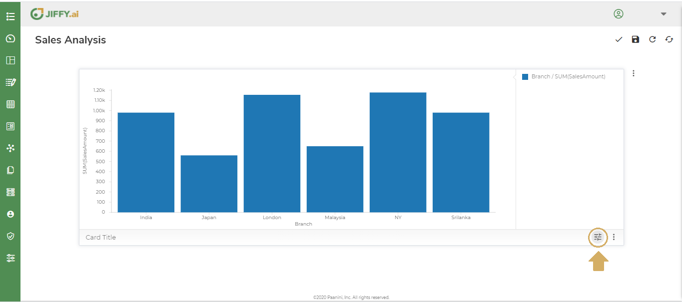
Click the  icon to edit the desired Chart in the Presentation.
Below are the Chart Properties available to customize the Chart.
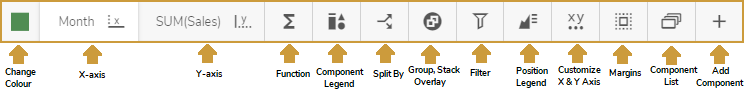
The Chart properties displayed depends on the Chart type.
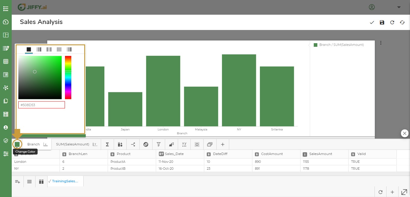
Use this option, to select the color for the Chart. Colors will enhance the data visualization and you can effectively communicate important information about your data.
Click the  icon to change the color.
Different color palette that you use in the Chart depends on the nature of the data mapped to the color.
In-built - You can select the desired color or provide the hex code for the specific color.
Sequential - A single hue intensifies to represent fixed incremental changes. A color with high saturation signifies higher range of values. Used for numeric variables or inherently ordered values.
Diverging - Features two colors that grow in intensity, away from each other. Used for numeric variables that has a meaningful central value.
Qualitative - Each color is used to identify a specific type of data. You can use different hues to distinguish between data types. Used when the variable is categorical in nature.
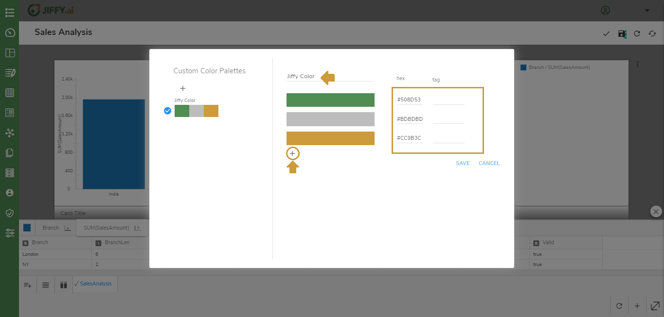
Custom - You can customize the color palette as desired.
Click the  icon to create Custom Color Palette and click the
  icon to select the Palette.

Provide an intuitive name for the Palette. Create the Palette by selecting the specific color or provide hex code for the specific color.
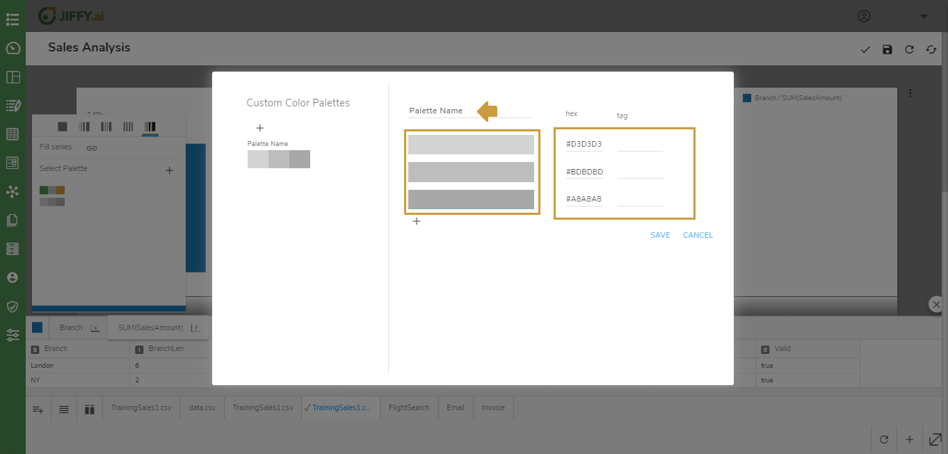
Click the icon to add more colors to the palette and click SAVE button.
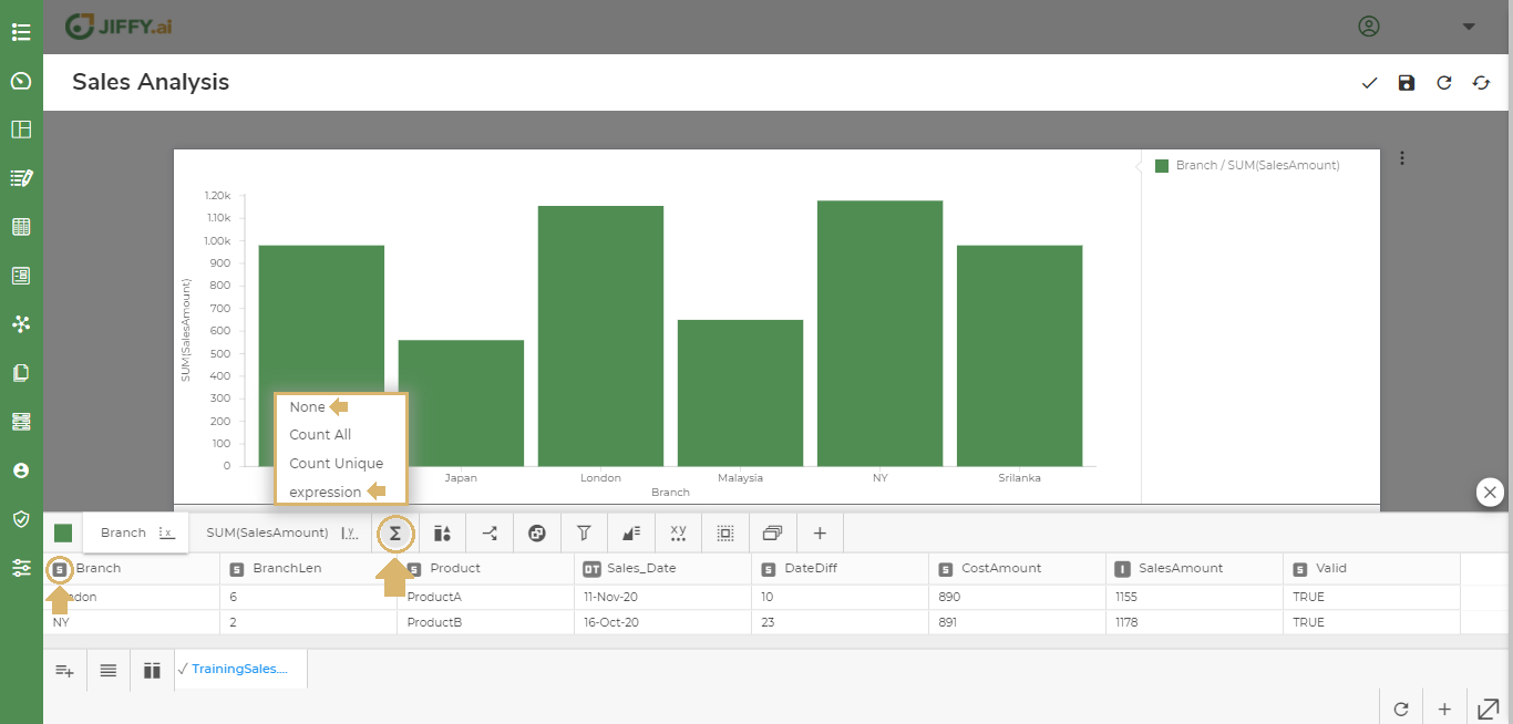
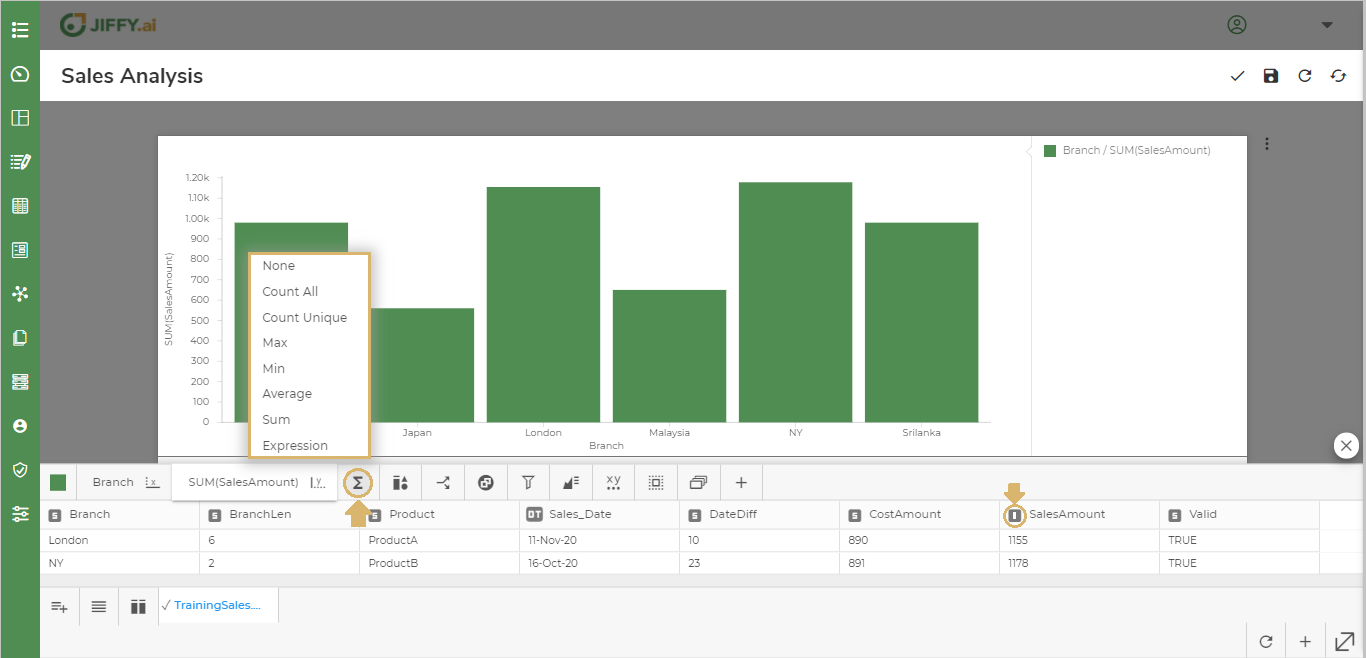
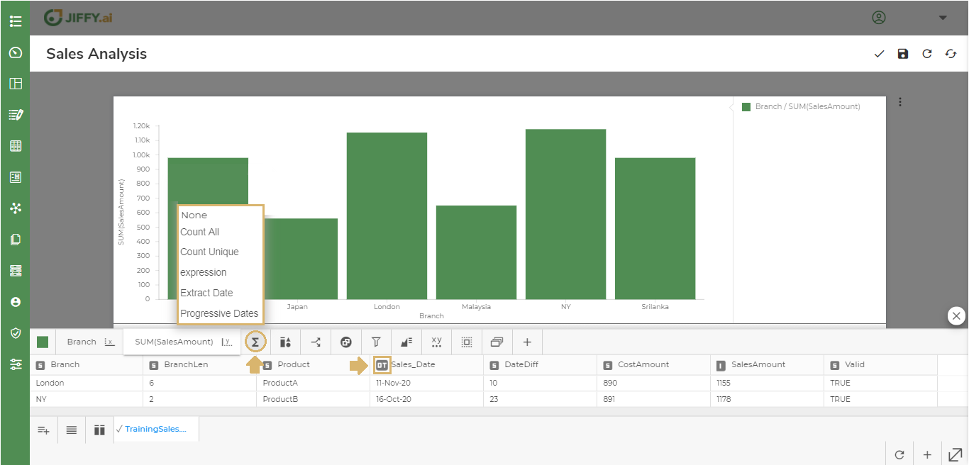
Functions can be applied to data plotted in the y-axis.
Click the  icon to change the function.
If the data type is String then functions such as Count All, Count Unique are listed.
If the data type is Integer then functions such as Count All, Count Unique, Max, Min, Average, Sum are listed.
If the data type is DateTimestamp then functions such as Count All, Count Unique, Extract Date and Progressive Dates are listed.
Click the  icon to change the Component Properties.
The component properties displayed depends on the Chart type.
Component Legend to display the legend keys for multiple components used in the Chart.
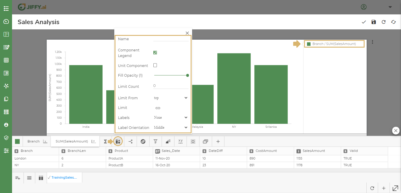
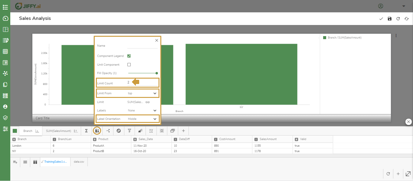
There can be large quantities of categorical values in the Chart when plotting data. Use this option to limit the top or bottom values.
Click the  icon in the Limit attribute.
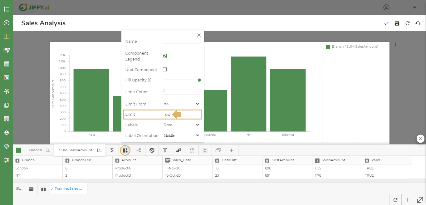
Select the column to set the limit. For example, SalesAmount - by default SUM function is selected. Change the function as desired.
Set the Limit Count as 2 and Limit From as Top to display the top 2 Branches with highest sales.
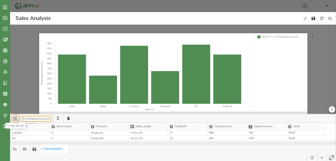
 Change the Limit From to Bottom to display the 2 Branches with lowest sales. For example, Japan and Malaysia Branches will be displayed as they have the lowest sales.
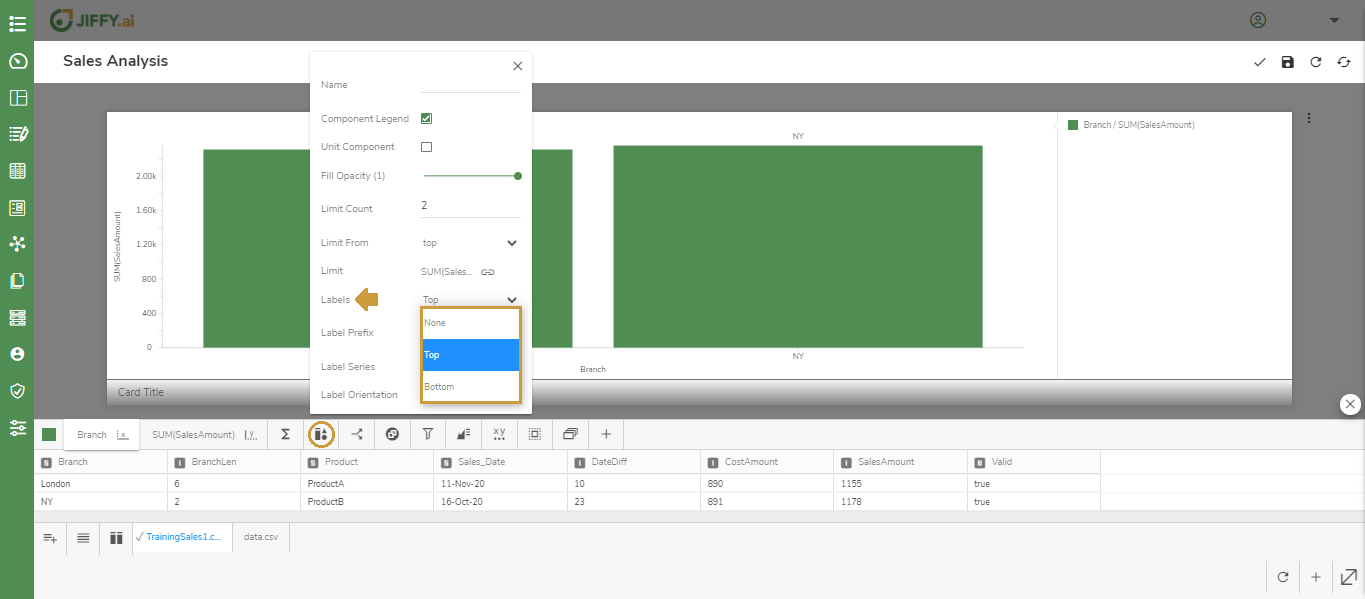
Use this option, to choose the position and orientation of labels in the Chart.
Set the Labels to display on Top or Bottom.
Set the Label Series to display the x-axis or y-axis names.
Set the Label Orientation either to Middle, Left, or Right.
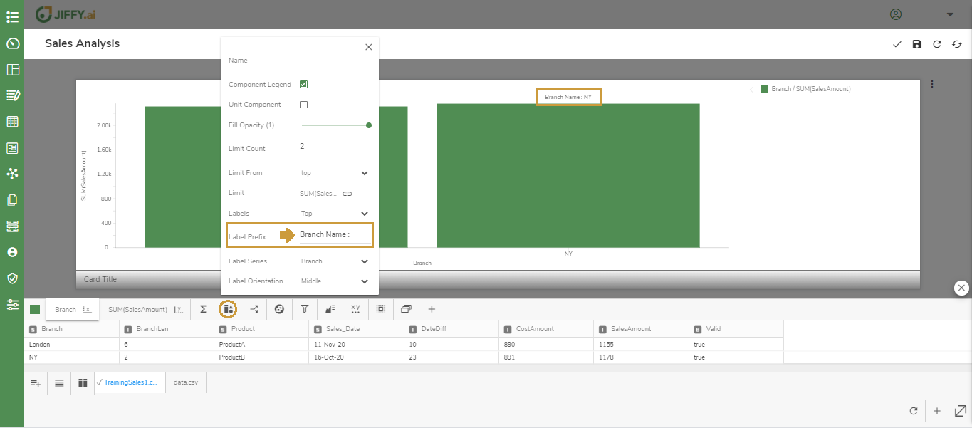
Set the Label Prefix to add a prefix before the selected label series. For example, Branch Name.
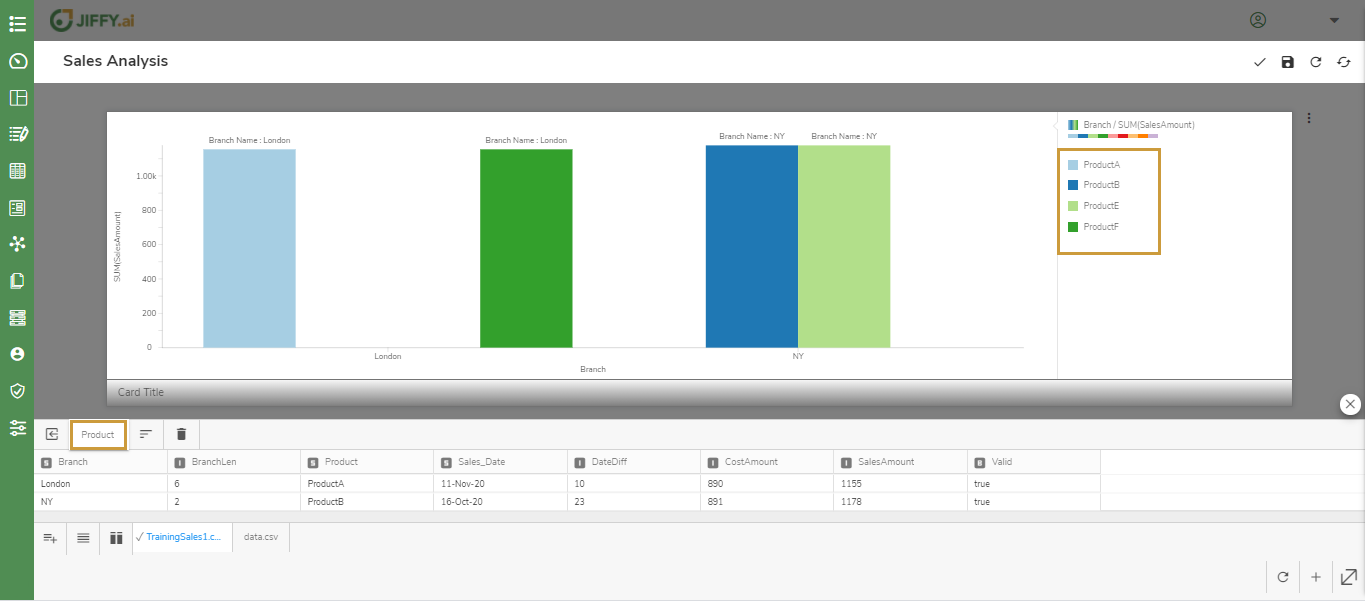
Click the  icon to split the Presentation data.
Select the field by which you want to split the data. For example, Product.
In the below example, the Data is Split based on Products and the Legend is displayed in the top right.
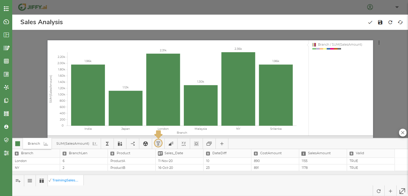
You can filter the data displayed in the Chart by adding conditions.
For example, To display the data for NY, Japan, and India only.
Click the  icon.
icon.
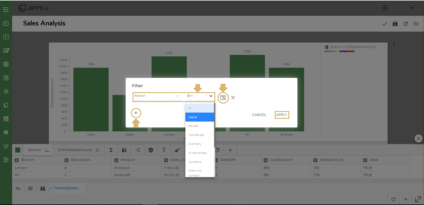
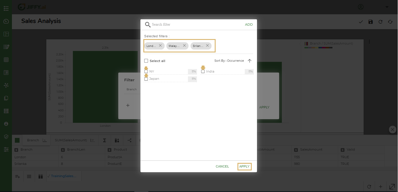
Select the column to filter on and select the condition, for example, Branch, not in.
Click the  icon and select the required column values.
Click on Apply.
 For example, when you select Branch not in London, Srilanka, Malaysia.
The chart displays data only for India, Japan, and NY data.
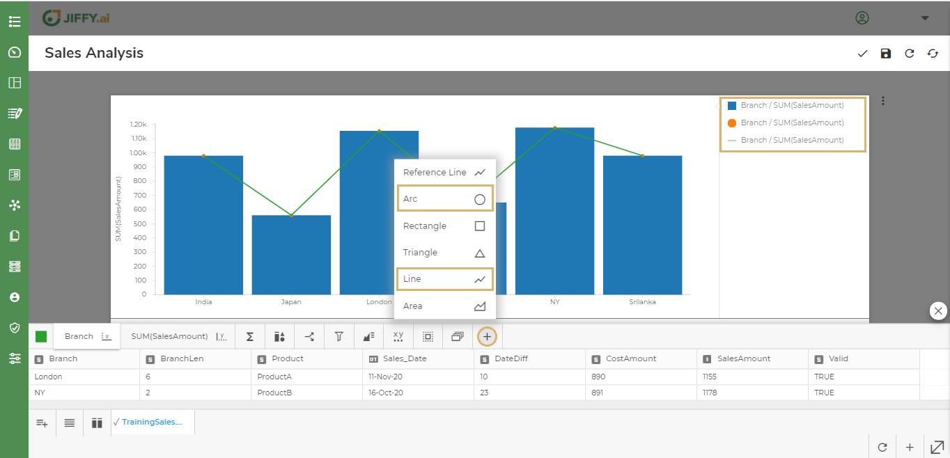
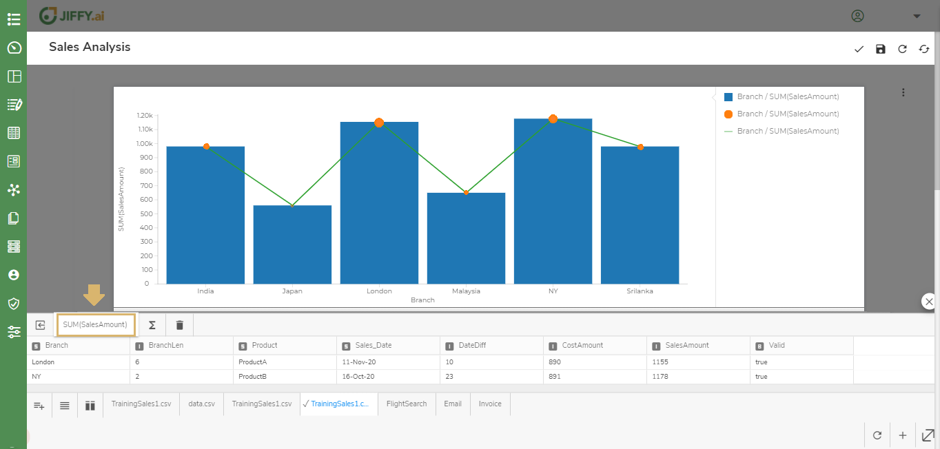
You can add additional components to the Chart for better understanding and visual effects.
Click the icon to add components.
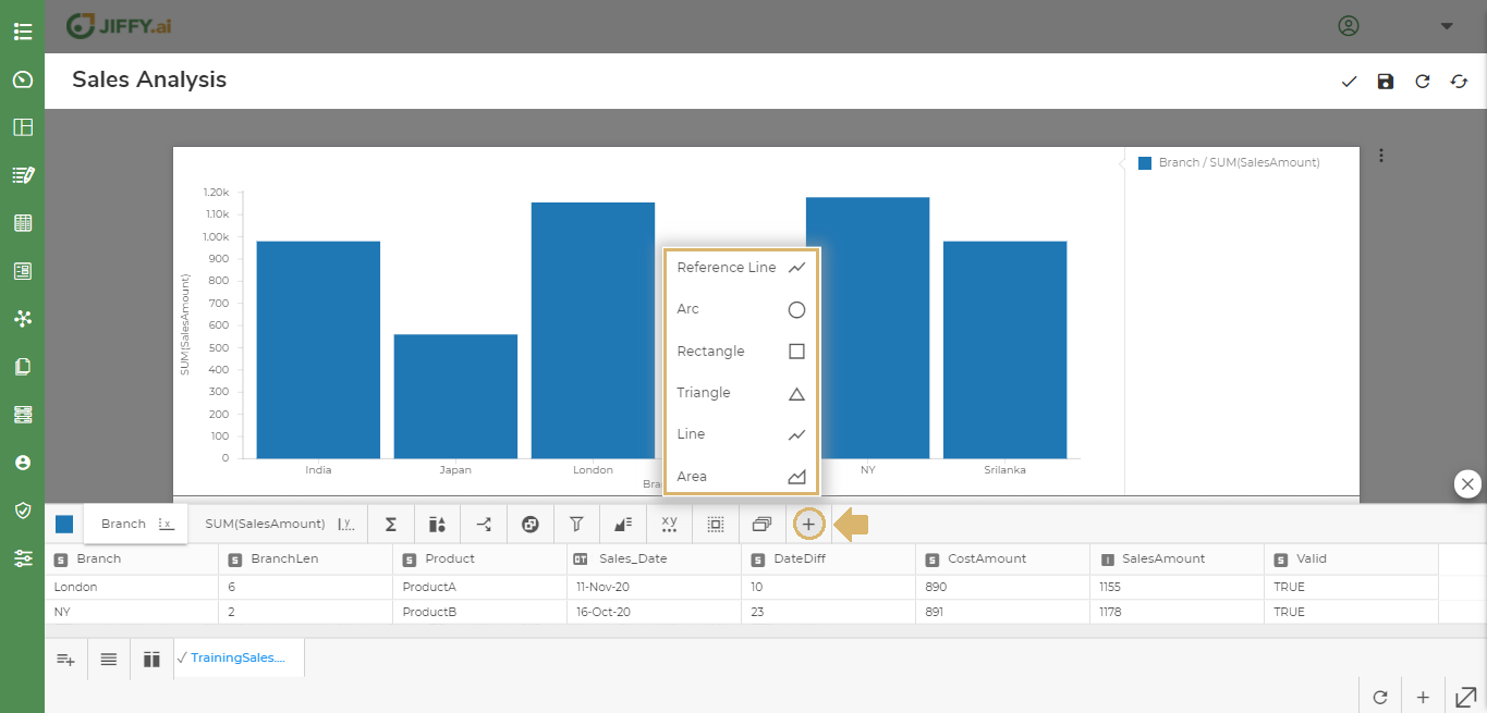
For example, The line and bubble on a Vertical Chart. The size of each bubble indicates the SUM(SalesAmount) for each Branch.
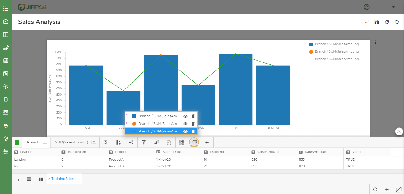
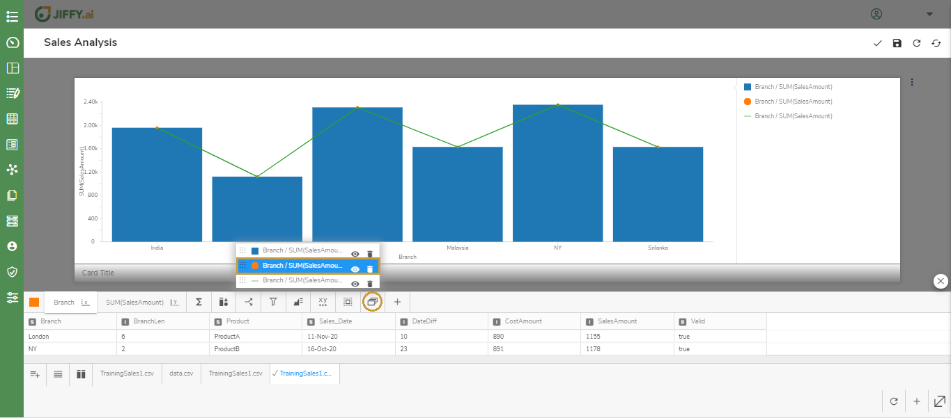
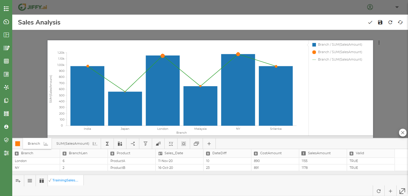
Click the  icon to change any particular property of the component.
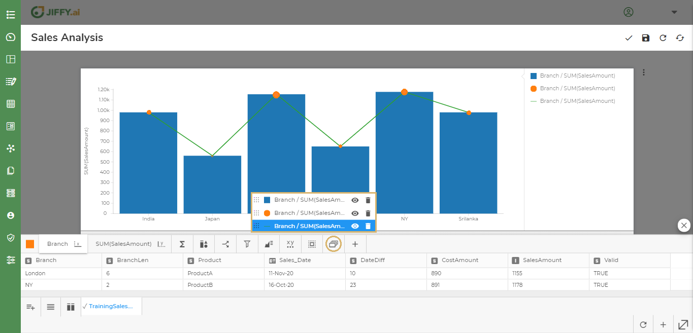
Select the required component from the list.
For example, Select either the Rectangle, Arc, or Line component accordingly.
To change size of the bubble, select the Arc component.
Click the icon and then click the icon from the Component Properties.
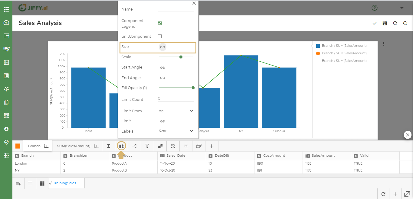
Select the field for displaying the size variation.
For example, Select SalesAmount as the size of the bubble to be displayed. The bubble size varies as per the SalesAmount in each Branch.
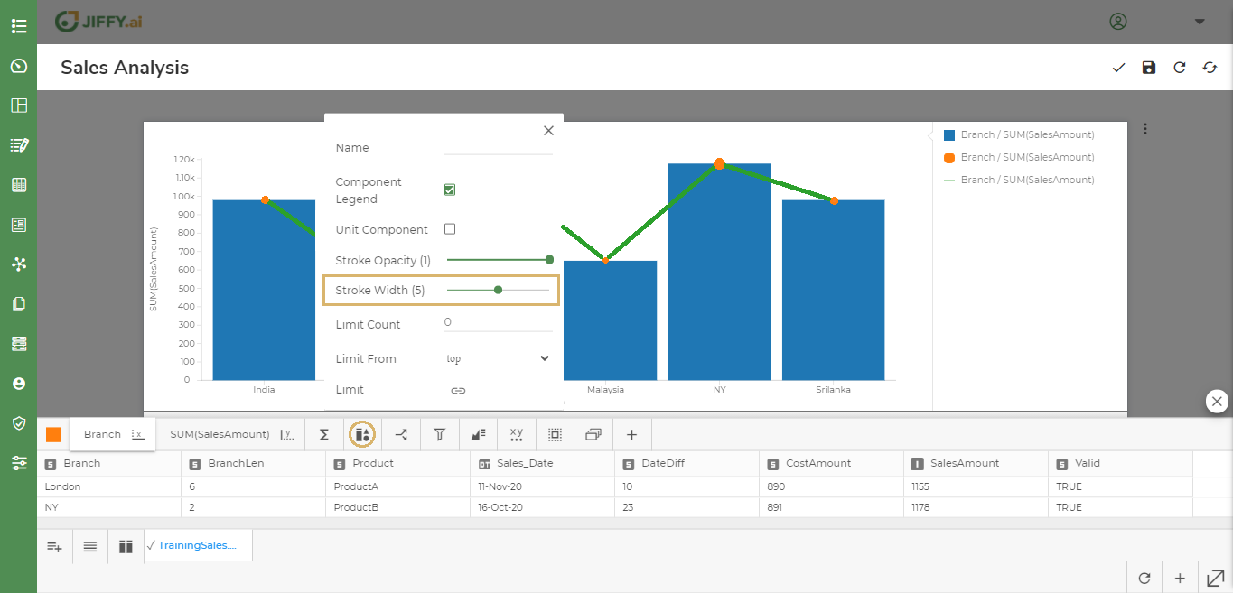
To change the stroke width, select Line component.
Click the icon and drag Stroke Width to the desired value.
Similarly, you can change the other properties of these components as per the requirement.
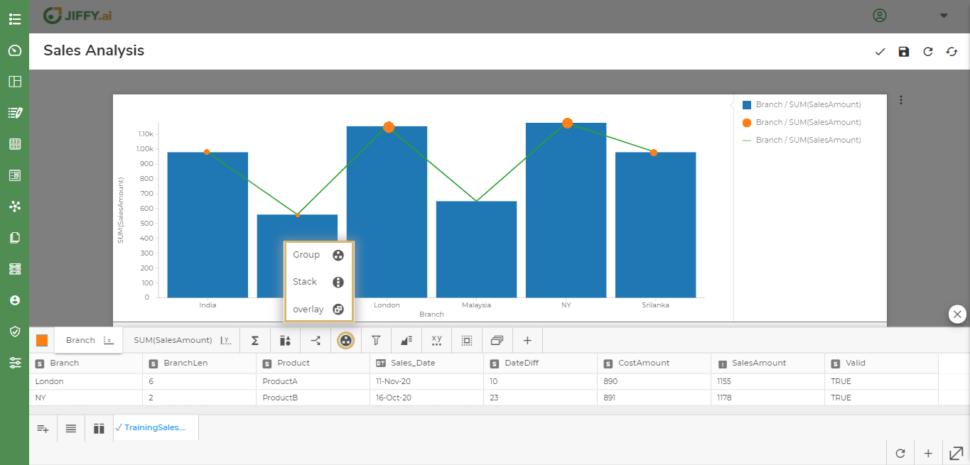
You can change the way components are arranged in the graph. For example, Stacked on top of each other, grouped together, or overlayed.
Click the  icon and select the type.
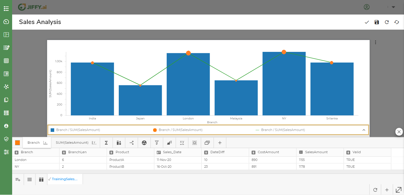
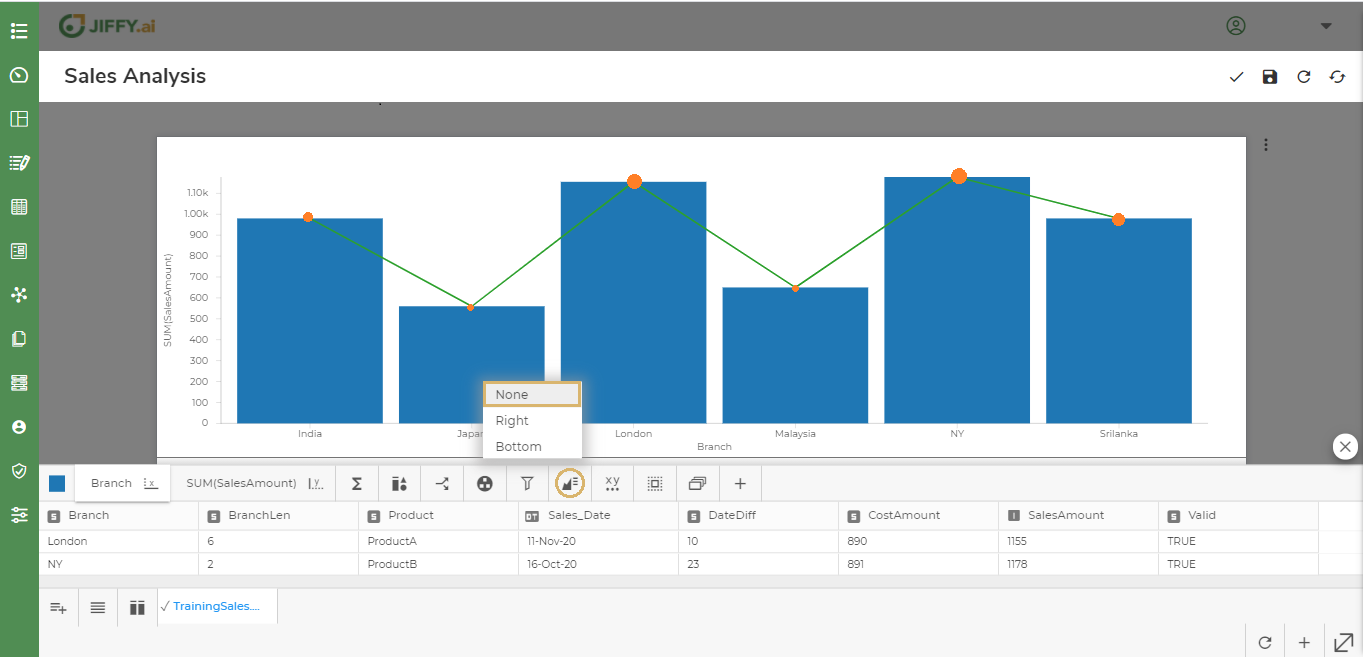
You can change the position of legend display to either Right or Bottom.
Click the  icon to change the legend position.
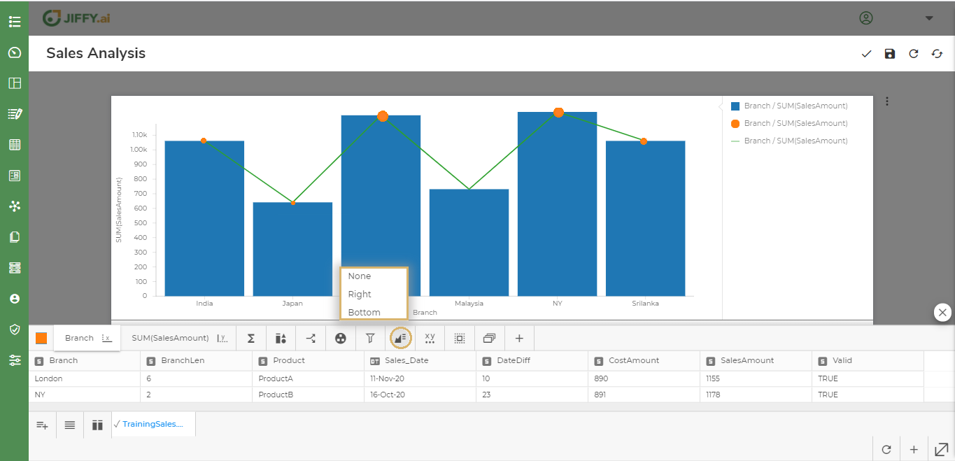
Legend position is set to Right by default.
Select Bottom to set legend at the bottom.
Select None, if the legend is not required.
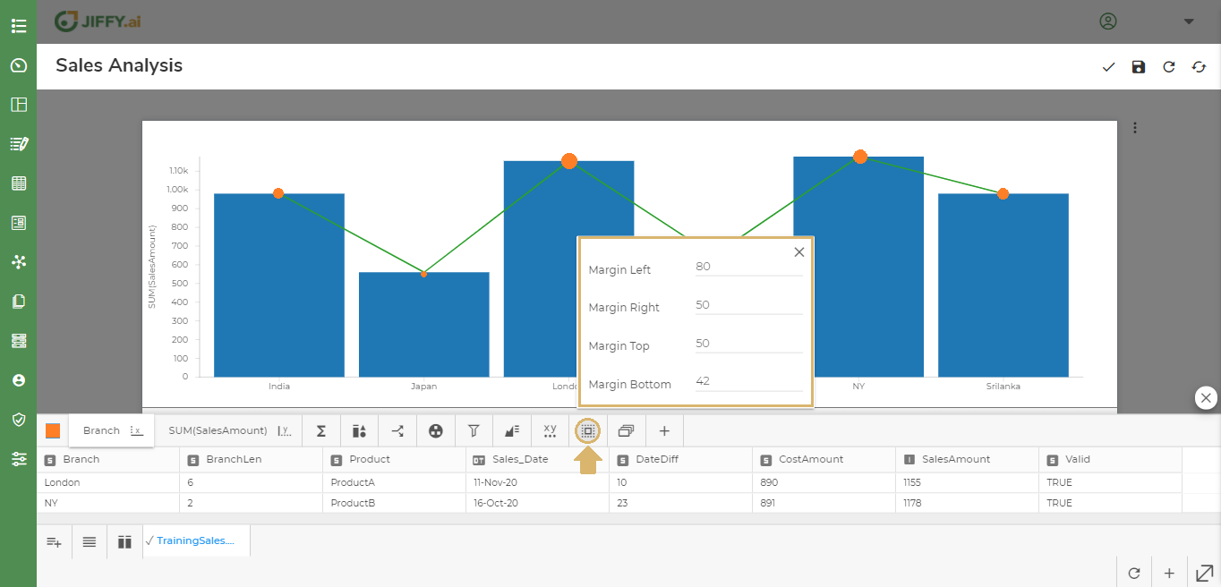
You can change the margin of the axis by using General Properties.
Click the  icon to change the margin.
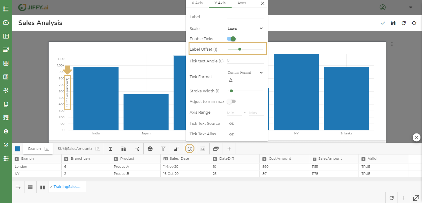
An axis shows data points that lie within a range of values. For each axis, you can specify the range, scale, and many other properties.
Click the  icon to change the Axis Properties.
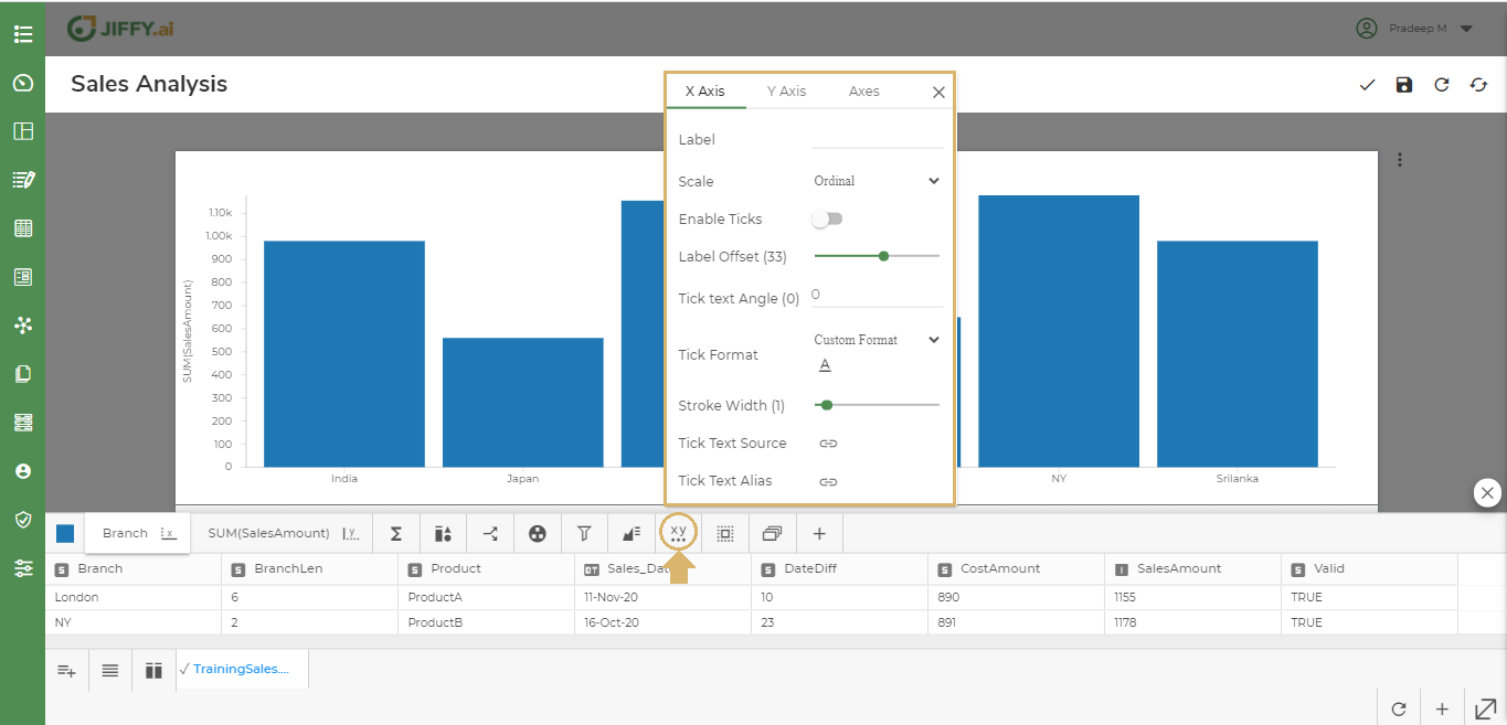
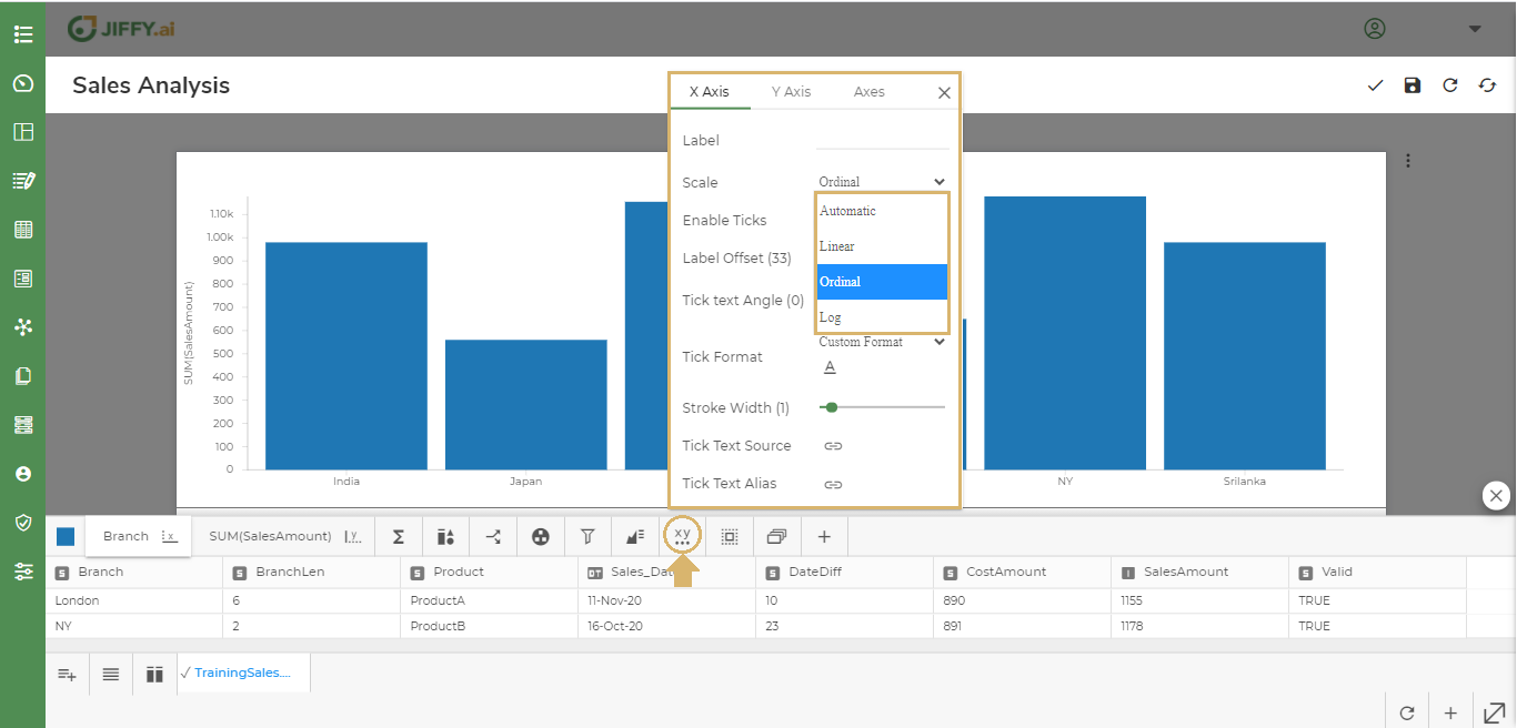
You can change the scale of the axis to Automatic, Linear, Ordinal or Log types.
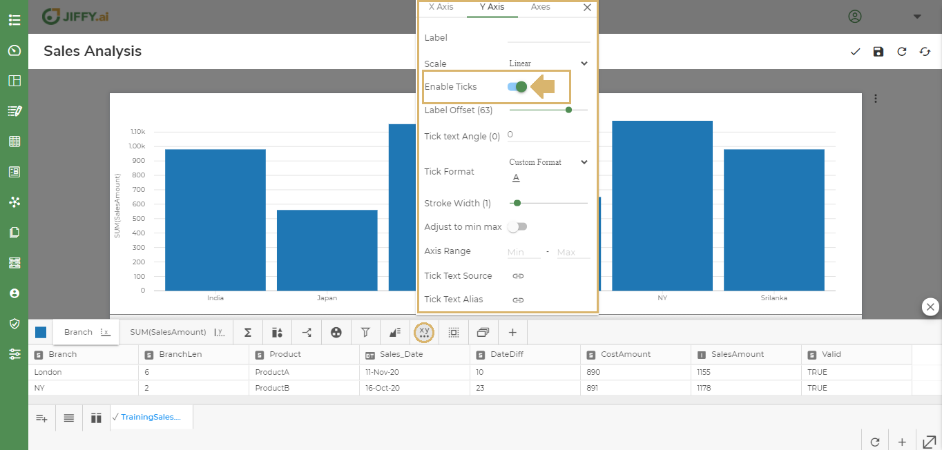
You can enable ticks to show the lines in x-axis and y-axis.
You can change the Labels position in the Chart.
In the below example, y-axis Label SalesAmount offset position has been reduced to 1, so it appears closer to the Bar.
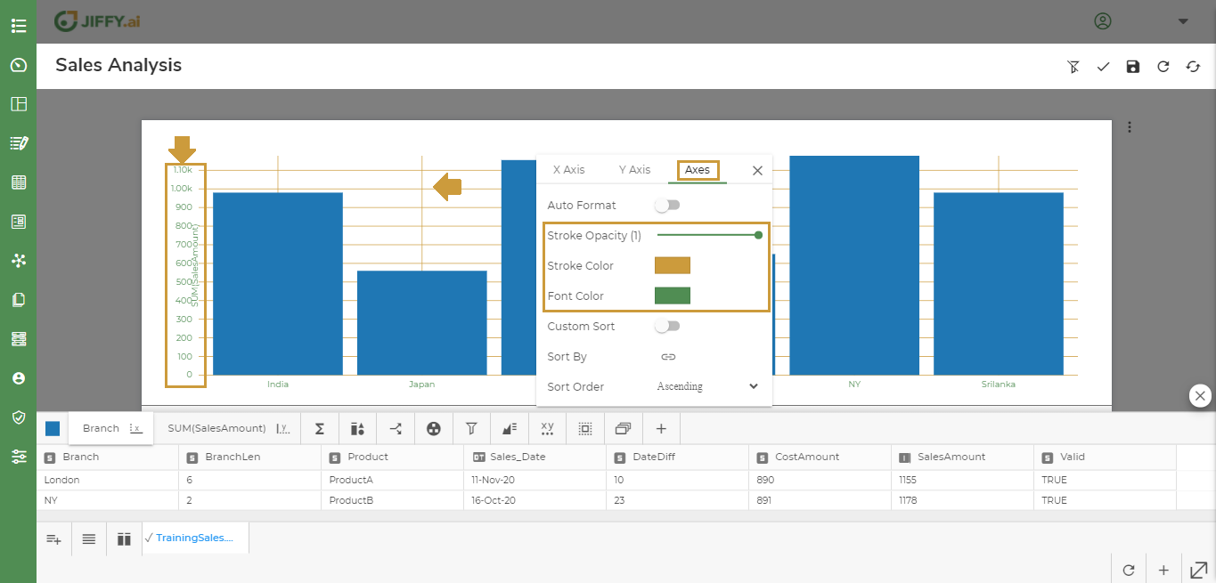
You can change the x-axis and y-axis Stroke Color, Stroke Opacity, Font Color as shown below.
You can change the Tick Text Angle as required. This option is useful when the tick texts are long and overlapping.
In below example, x-axis Branch names are tilted to 45 degrees.

By default, the axes values are sorted alphabetically. Use this option, to custom sort the display. For example, to view the vertical bars on x-axis in Branch order of Srilanka, NY, Malaysia, London, Japan, and India, change it using this option.
Provide the sort by values and click on ADD and SAVE.
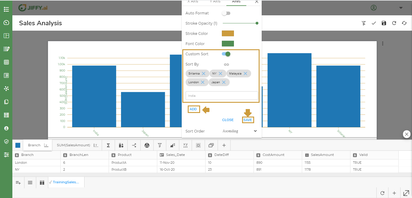
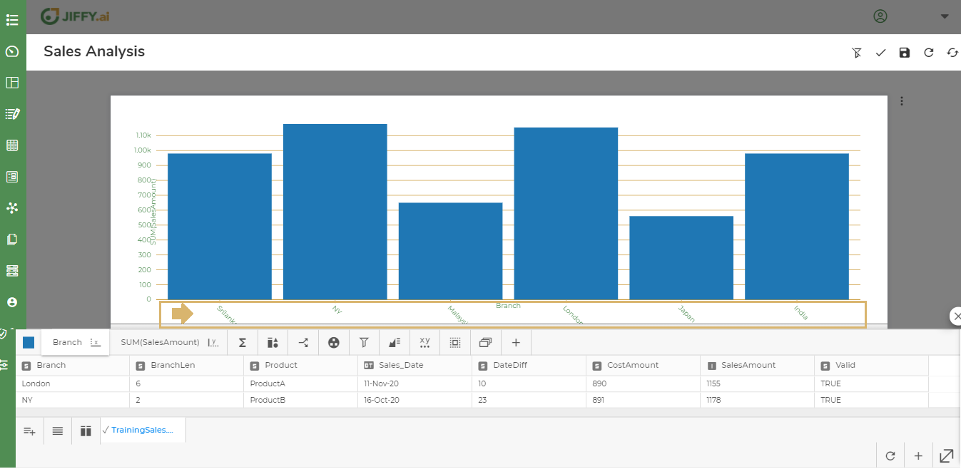
In the below example, the values are changed as per the order.
Use this option, to sort the order in which the bars appear in the, Ascending or Descending.
Click the Sort by > Select Branch > Set Sort Order as Descending order.
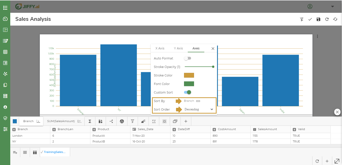 Now the Chart displays the Branch in Descending Order.